Okay, so let’s talk about the wind rose.
Most people, when they see a fancy compass on a map, just assume it’s for direction.
But the wind rose is actually way cooler than that.
It’s like a fingerprint of the sky.
From what I’ve seen, a lot of students get confused between the compass rose and the wind rose.
They look super similar, right? Both are usually a star shape with little lines sticking out.
But they serve totally different masters.
One is about finding your way north, and the other is about understanding the mood of the air around you.
What Exactly Is a Wind Rose?
Strictly speaking, a wind rose is a graphic representation of the direction the wind blows.
It shows the frequency of winds coming from different directions.
It’s a statistical tool.
You can use it to figure out where the wind comes from most often, or where it never seems to go.
But here is the twist: the term actually comes from history.
Before we had computers or weather balloons, sailors used something called the “Rose of the Winds.” You see this all the time in old maps.
The Ancient Roots: Portolan Charts
So, picture this: you’re a sailor in the 14th century.
You have no GPS. And this is where things get interesting.
You don’t even have a compass yet.
You only have the stars and the ocean.
But you need to get from Italy to France.
You have a Portolan chart. Oddly enough,
It looks like a weird spiderweb of lines on a piece of parchment.
Those lines aren’t roads; they are navigation routes.
And at the center? There’s that classic star shape. And this is where things get interesting.
That’s the Rose of the Winds.
Each arm of that star pointed to a cardinal direction.
But here’s the thing—navigators often didn’t trust magnetic north because the compasses were wonky.
They trusted the local knowledge.
They knew exactly where the wind came from at that specific coastline. But there’s a catch.
So, the wind rose wasn’t just a design; it was a survival chart.
It basically told them: “Hey, if you want to get to that harbor, the wind is blowing from the North-East, so you better tack sideways.”
Modern Day: The Meteorological Wind Rose
Fast forward to today.
We don’t use paper charts to survive, but we use the wind rose analysis for everything from building airports to planting crops.
In meteorology, the wind rose is a histogram.
It’s usually circular.
The center of the circle is 360 degrees.
The outer edges show the wind speed.
Most of the time, you’ll see three or four different roses on one chart for different times of day or different months of the year. Oddly enough,
This is called a bivariate polar plot.
It sounds complicated, but it’s actually just data visualization.
How to Read the Lines and Barbs
If you look at a modern wind rose, you might see lines or little circles and feathers (barbs).
Here is how you decode it without getting a headache.
- Direction: The lines sticking out from the center point to where the wind is coming from.
If a line points to the North, the wind is blowing South-to-North.
- Length: The longer the line, the stronger the wind.
It’s a logarithmic scale, so a short line might be 5mph, and a long one might be 30mph.
- Barbs: These are like feathers.
A full feather usually means 10 knots. Here’s the interesting part.
A half-feather is 5 knots.
It’s the same system used on anemometers.
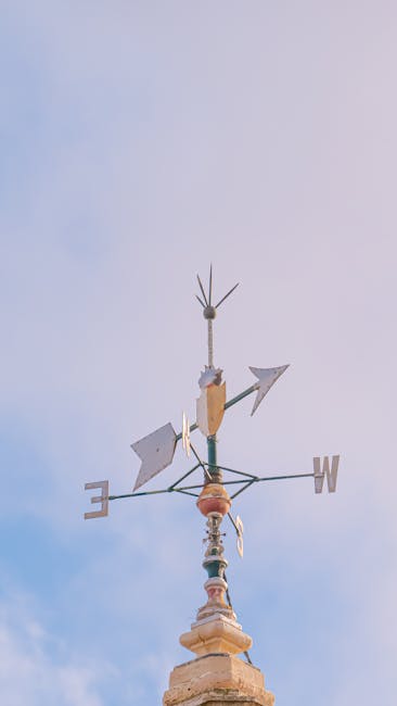
The Compass Rose vs.
The Wind Rose
This is where it gets tricky.
If you google “wind rose,” you might just see a compass rose. But there’s a catch.
They are related, but they aren’t twins.
The compass rose is about navigation. Here’s the interesting part.
It tells you North, South, East, and West.
It’s fixed.
The wind rose is about the environment.
It changes.
A wind rose shows variability.
It shows you that in January, the wind blows mostly from the East, but in July, it might switch to the West.
I think a lot of people miss this distinction.
They think the compass is a weather chart.
It’s not.
Why Does a Wind Rose Matter to You?
You might be thinking, “Okay, cool history, but I don’t live on a ship.
Why do I care?”
Well, let’s look at it from a practical angle. Here’s the interesting part.
If you are planning a wind farm, you need a wind rose.
You need to know if the wind blows consistently in one spot or if it swirls around.
If you are building a house, you care about prevailing winds for heating and cooling.
From what I’ve seen in real estate, wind rose data is becoming more common in architectural plans.
It helps with passive cooling strategies.
If you know the wind mostly comes from the North, you don’t want a giant window on the North wall.
Using Data for Trend Analysis
Advanced users look at wind rose trend analysis.
This means comparing two different time periods.
Did the wind change direction in the last ten years?
It’s actually kind of scary how much climate data is in these charts.
Scientists use them to track climate change.
If the patterns shift, the wind roses change.
Tools to Analyze Wind Data
Now, if you actually want to create your own wind rose, you can’t just draw it. Here’s the interesting part.
You need data.
There are tons of online tools and GIS software that can generate these for you.
Most of them pull data from weather stations or satellite imagery.
You just input the coordinates, and the software spits out a pretty rose for you.
It’s pretty handy if you are doing a project.
If you are looking for a free option, just search for “meteoblue wind rose” or check local meteorological agency websites.
They usually publish these charts for major cities.
Common Mistakes Beginners Make
I made a mistake once when I first started looking at these charts.
I thought the lines meant the wind was going to the direction.
Wrong.
The wind rose always shows where the wind is coming from.
It’s counter-intuitive, I know.
That’s why I always double-check the legend.
Conclusion
So, the next time you see that star shape on a map or a weather app, take a second look.
It’s not just decoration.
It’s a summary of the atmosphere.
Whether it’s helping a medieval sailor find a harbor or helping a modern architect design a sustainable building, the wind rose tells a story about the air around us.
And honestly? That’s a pretty cool story to read.
Image source: pexels.com
Image source credit: pexels.com